Turning Around a Stalled Product Builder

Setting the scene
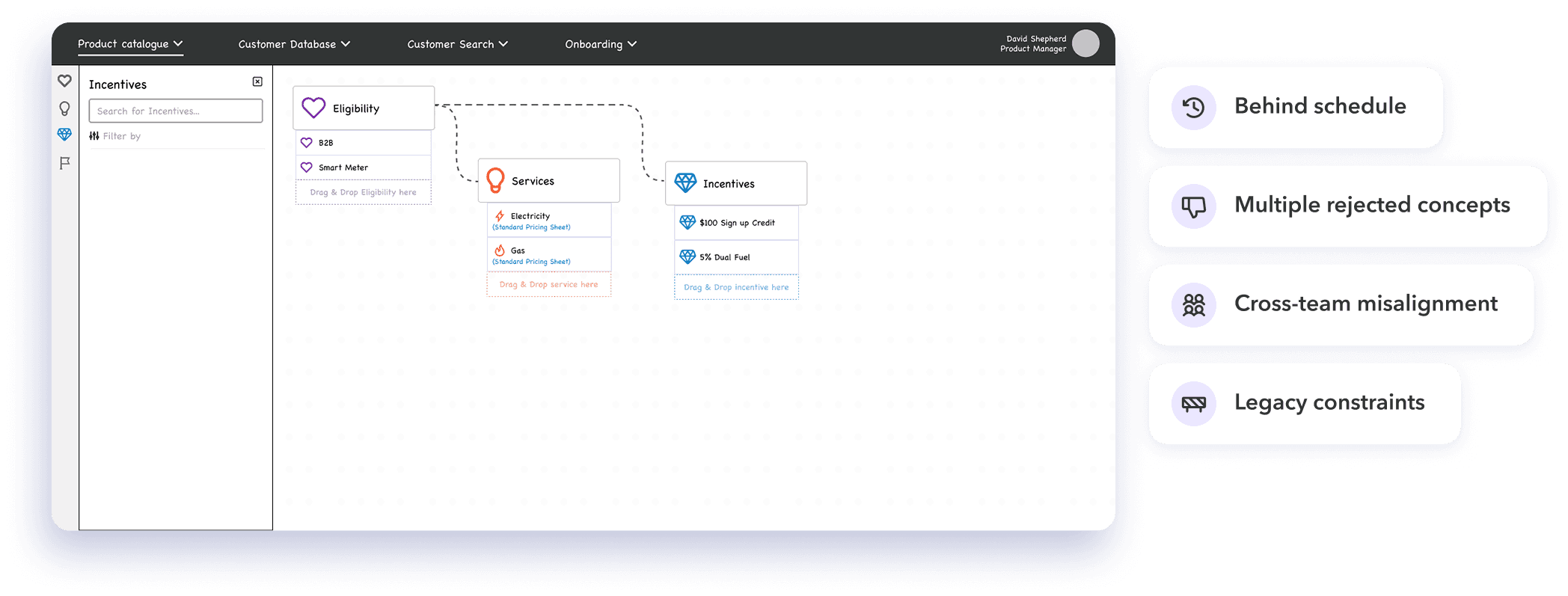
When I joined Gentrack, the Product Builder project was already underway but lacked a clear design direction.
Several approaches had been explored, but none had landed with stakeholders. The team was behind schedule, and alignment across product, design, and leadership was breaking down.
I was brought in to reset the approach, align stakeholders, and move the product towards delivery.
Working within real constraints
This wasn’t a blank-slate project.
There were existing designs, technical considerations, and growing pressure to deliver. Starting over wasn’t an option — the challenge was to find a direction the team could align on and build from.
Defining the real problem
The issue wasn’t just the interface.
The product itself was difficult to understand — both for users and stakeholders. Previous designs hadn’t clearly represented how the system worked, which made them hard to validate and move forward.
Before improving the UI, the underlying structure needed to be addressed.
Aligning the team through a Lean UX workshop
To create a shared understanding of the problem, I facilitated a Lean UX canvas workshop with key stakeholders across product, design, and engineering.
This helped bring together:
Business goals
User needs
Success metrics
Assumptions about how the product should work
It moved the team from fragmented opinions to a more structured view of the problem space.
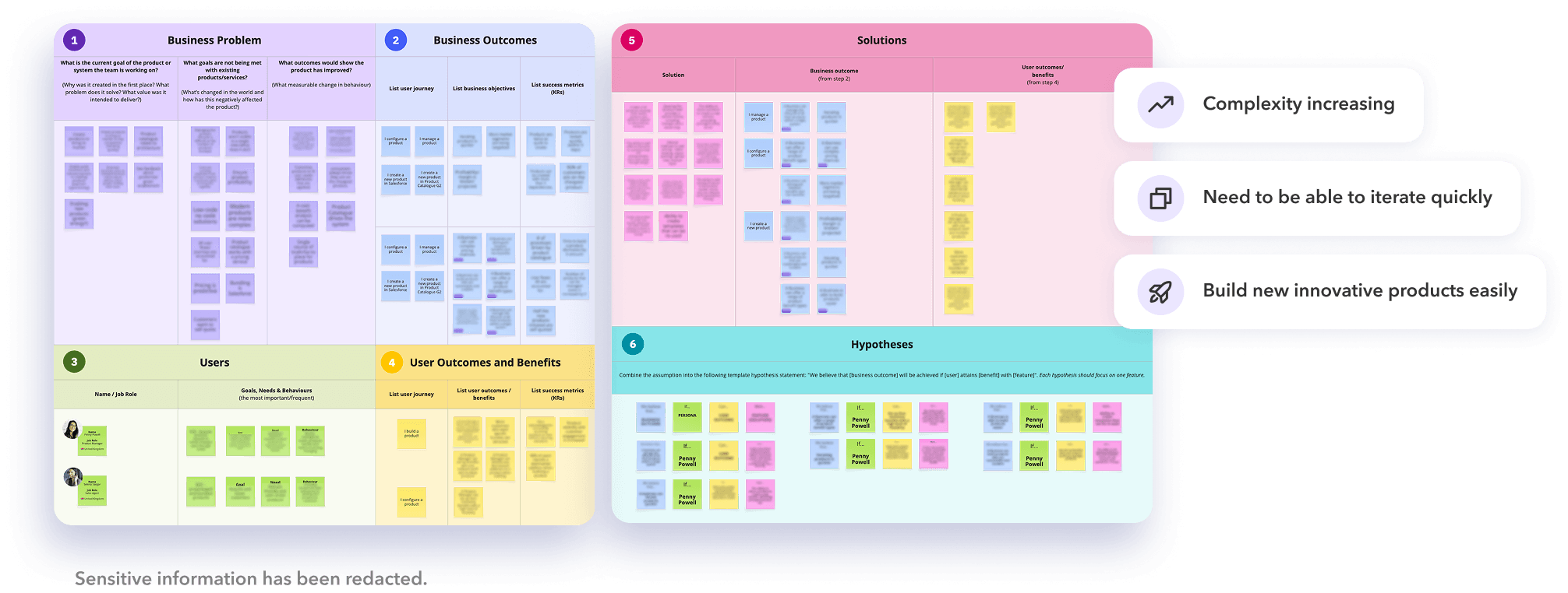
A few things became clear:
The product needed to support increasingly complex configurations
There was no single, clear view of a product and its structure
Speed to market and iteration were critical business drivers
This gave us a foundation to move forward with clearer priorities.
Grounding the problem in real user needs
Alongside stakeholder alignment, we conducted field studies and interviews with product managers.
These revealed the realities of their role — balancing commercial demands, system constraints, and constant change.
We captured this in a persona to align the team on who we were designing for.
Key themes:
The need to move quickly while managing complexity
Frustration with unclear workflows
Reliance on mental models to understand product structure
This ensured the work stayed grounded in real usage, not just system logic.

Understanding where things broke down
Usability testing exposed consistent issues.
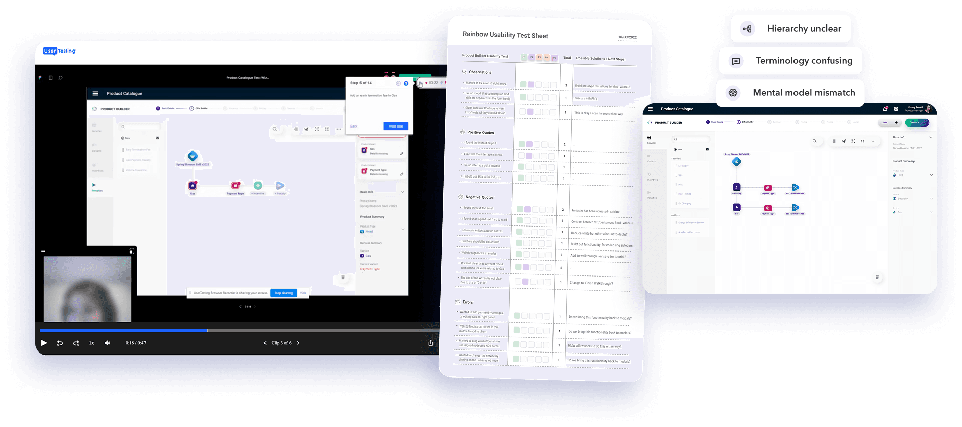
Users struggled to understand how different parts of the system related to each other. Many approached the interface as a linear journey, even though the product was inherently non-linear.
Terminology added further friction, making it harder for users to confidently complete tasks.
At the same time, some interactions worked well — particularly drag-and-drop and guided actions like “Resolve Next”.
Changing the approach
Rather than continuing to iterate on existing designs, I stepped back and reworked the underlying structure.
The focus shifted to making the system easier to understand and navigate:
Clarifying relationships between elements
Introducing guidance within workflows
Reducing reliance on domain knowledge
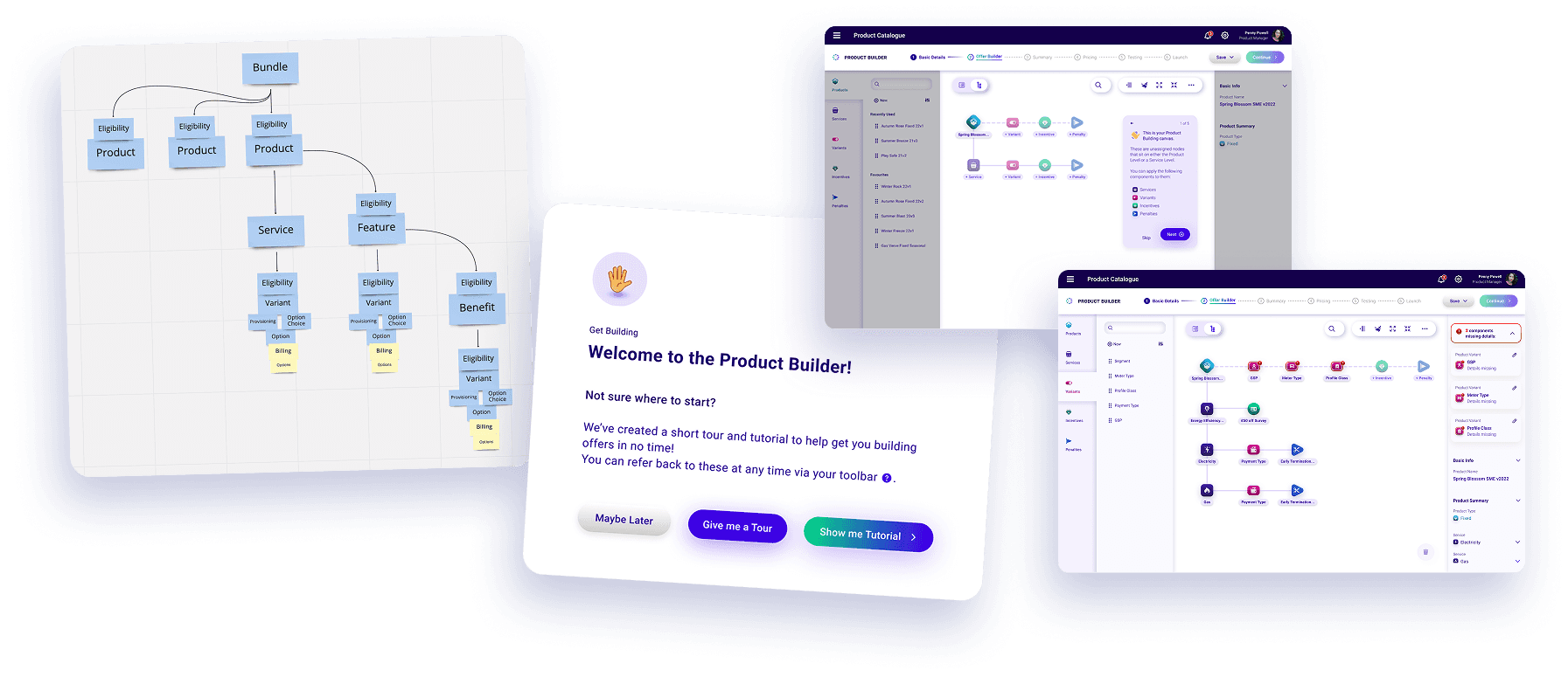
This led to a more intentional system design:
Clearer hierarchy and grouping
Guided flows within a flexible, non-linear experience
Improved labelling and terminology
The goal wasn’t to simplify the system, but to make it easier to reason about.
This shift helped move both users and stakeholders from confusion to clarity.
Shaping the visual foundation
As the first product in the suite, Product Builder set the visual direction for everything that followed.
We were initially asked to adopt existing brand guidelines, but these were designed for marketing and didn’t fully support complex UI needs.
To explore this, we ran visual style tests comparing different approaches.
The results showed:
Simpler interfaces improved usability
Stronger hierarchy improved task success
Brand-led styles were less effective
These findings helped justify evolving the visual approach.

Driving alignment
With a clearer structure and direction, stakeholder alignment improved significantly.
Design conversations became more focused, feedback more actionable, and the team was able to move forward with confidence.
Outcome
The work established a clear foundation for Product Builder.
It improved usability, created alignment across teams, and defined patterns that influenced the wider product suite.
What I’d carry forward
Structure matters more than screens in complex systems
Alignment comes from clarity, not volume of ideas
Research is only valuable when it drives decisions
Early products shape everything that follows