Scaleable Design System

Building a Scalable Design System from Scratch
When I joined Gentrack, design work was spread across multiple products with no shared system in place. Patterns varied between teams, components were often recreated, and there wasn’t a clear connection between design decisions and how things were implemented in code.
This meant teams were spending time solving the same problems repeatedly, and the overall experience felt inconsistent.
Accessibility also wasn’t applied consistently, and there was no structured way to support themes like dark mode without creating separate designs.
Starting with Foundations
The initial focus was on getting a usable component library in place. At the time, design tokens weren’t available in Figma, so components were built using defined styles and manual consistency across the library.
Once the system started to grow, it became harder to maintain that consistency. Colours, spacing, and typography were applied within components, but there wasn’t a single, structured way to manage them across the system.
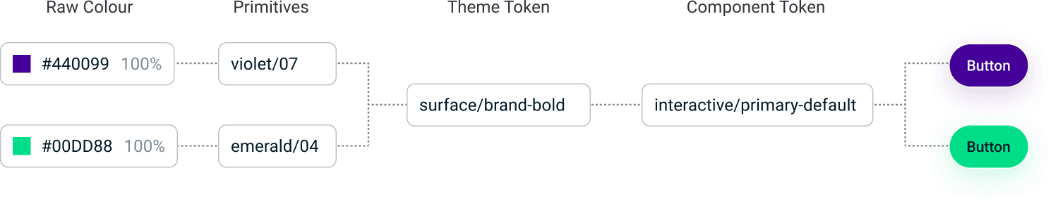
When Figma introduced tokens, I brought them into the system and refactored the existing components to use them.
I defined tokens for colour, typography, spacing, and layout, and replaced hard-coded values with semantic naming (e.g. background, surface, text-primary). This made it easier to reuse styles and update them without touching every component individually.
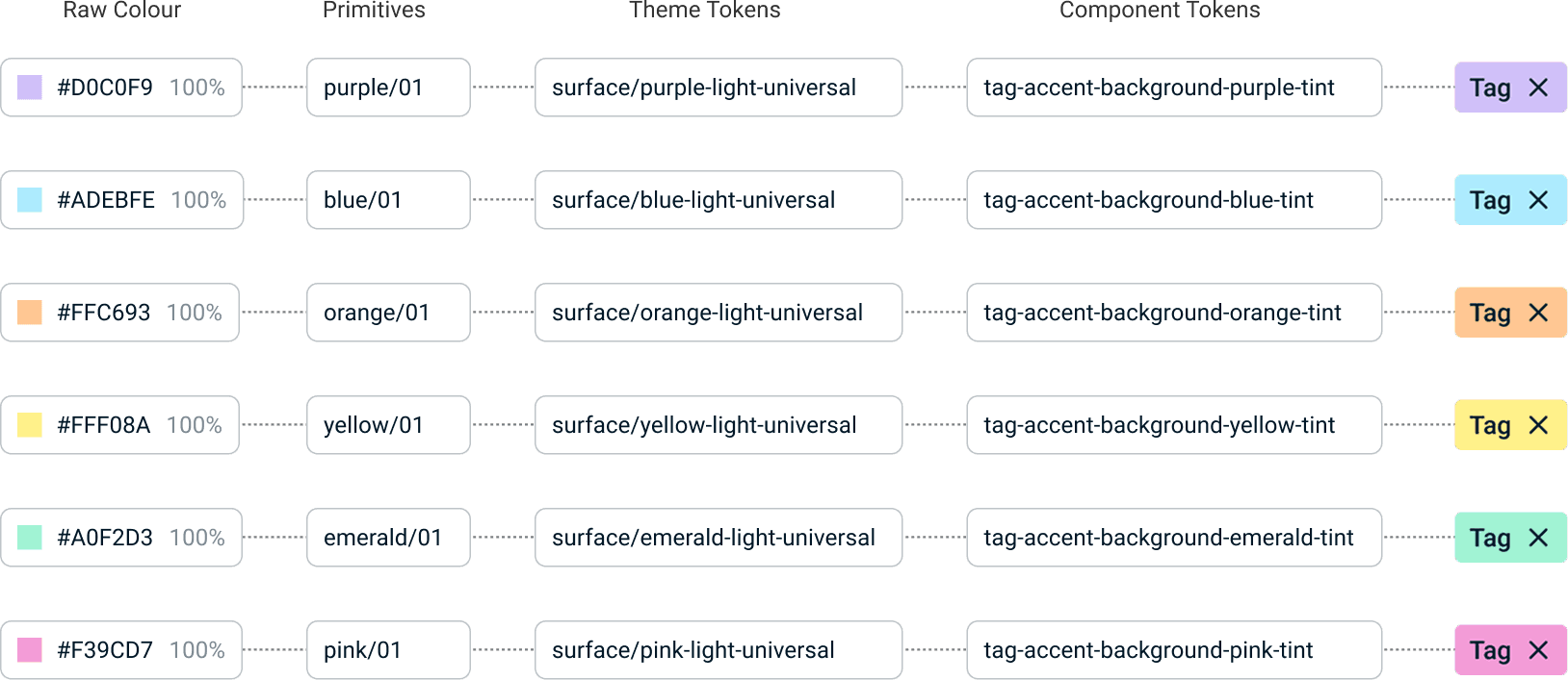
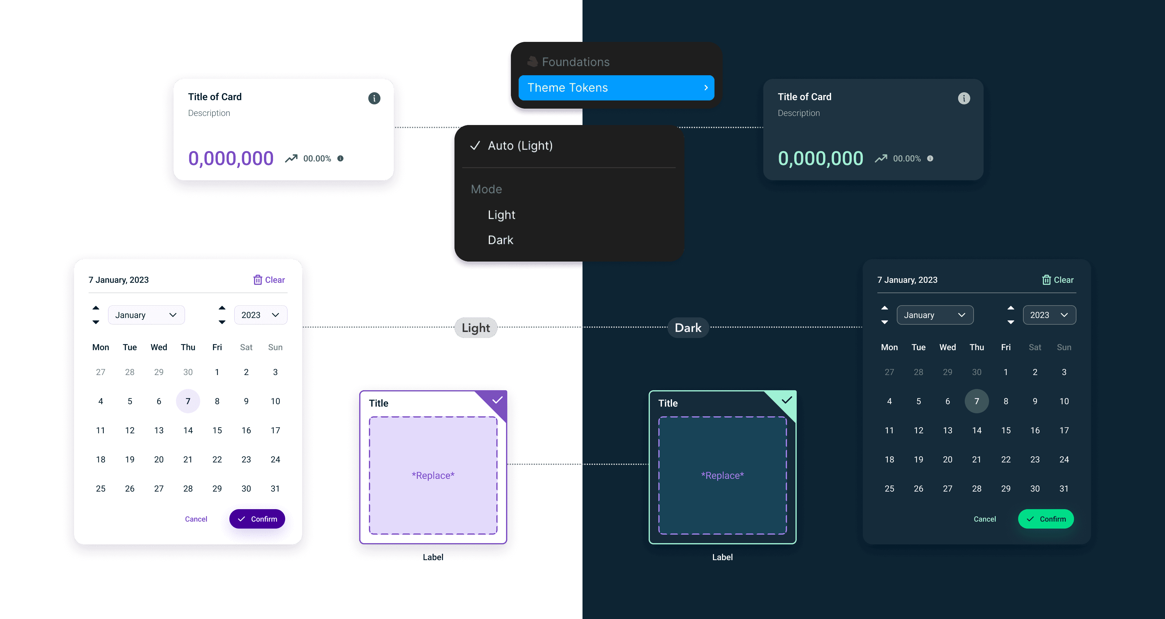
Bringing in tokens also made theme support much more manageable.
Instead of creating separate versions of components, I mapped token values for light and dark themes. The components themselves stayed the same, and only the underlying values changed.
That meant we could support both themes without doubling the work.
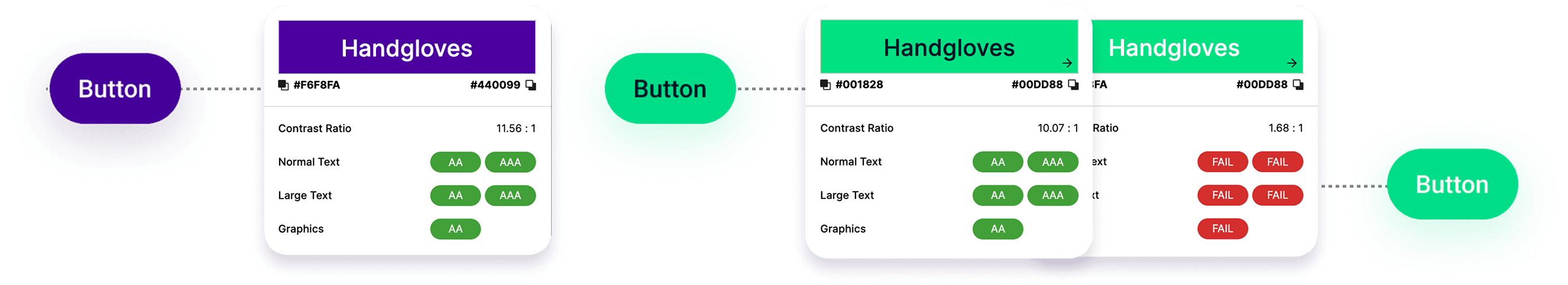
The move to tokens also helped tighten up accessibility.
It made colour usage easier to review and standardise, especially for contrast. Typography and spacing could be applied more consistently, which reduced the chances of inaccessible patterns slipping through.
Design decisions that were previously manual became part of the system.
Structuring the System
I organised the system using an atomic approach:
Atoms for basic elements like buttons and inputs
Molecules for grouped elements such as form fields
Organisms for more complex patterns like navigation and tables
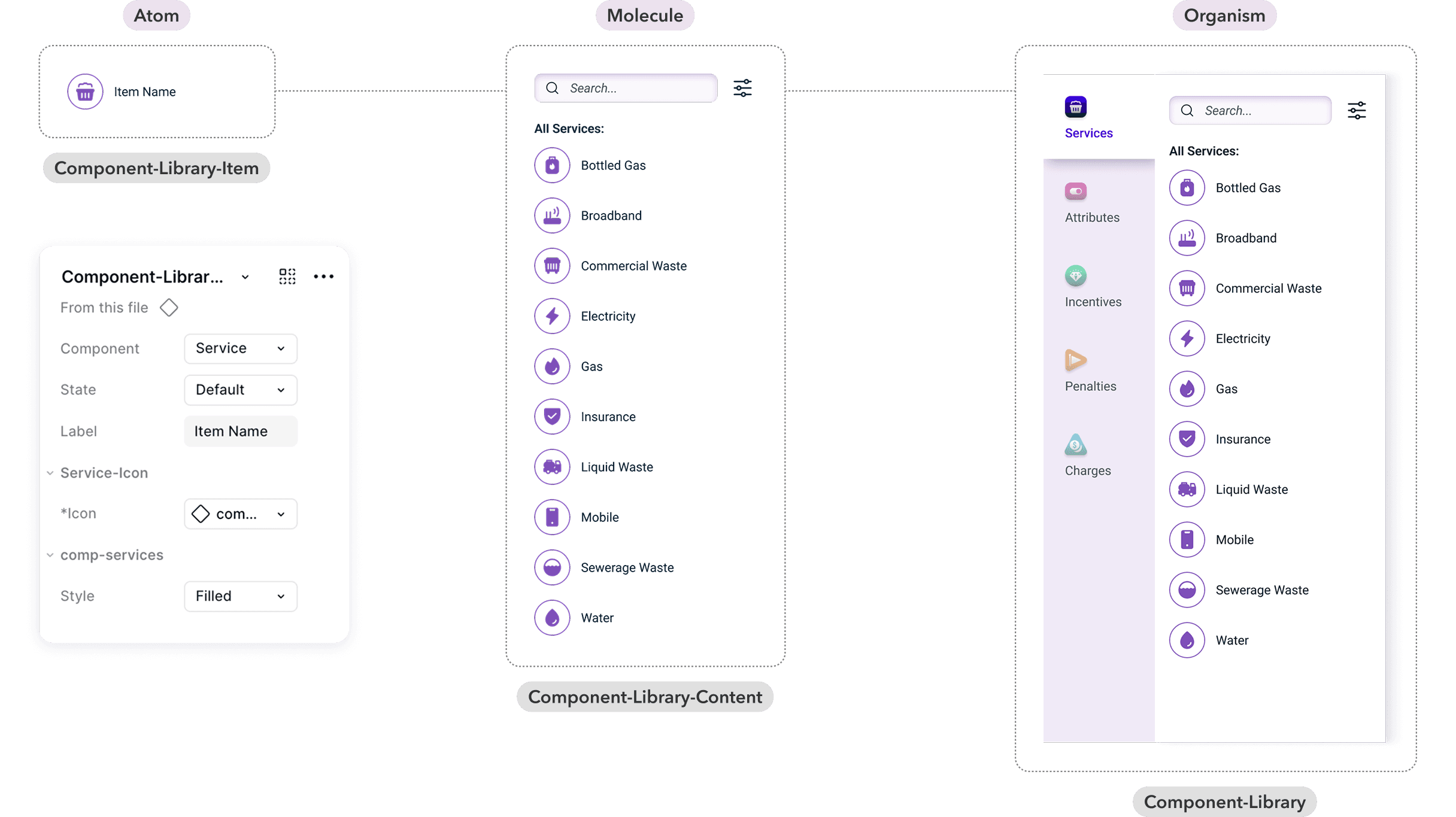
This gave the system a clear structure and made it easier to scale across different products.
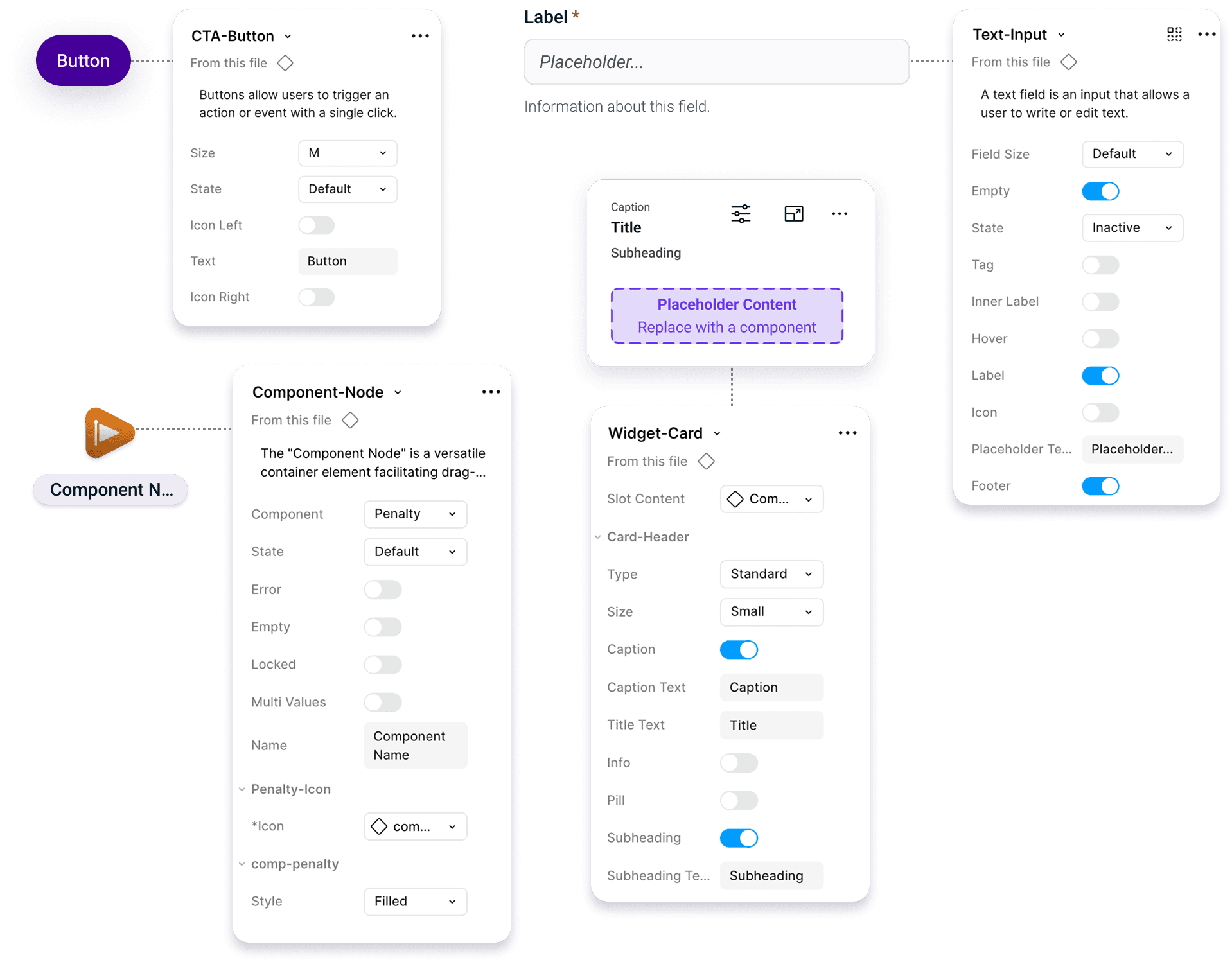
In Figma, components were built using variants and properties so they could handle different states and configurations without duplication. The focus was on making them flexible enough to cover real use cases, not just ideal scenarios.
Supporting Light and Dark Themes
Theme support was built into the system through tokens.
By defining colours semantically, I could create separate light and dark values while keeping the component structure the same. This meant we weren’t maintaining two versions of the same component.
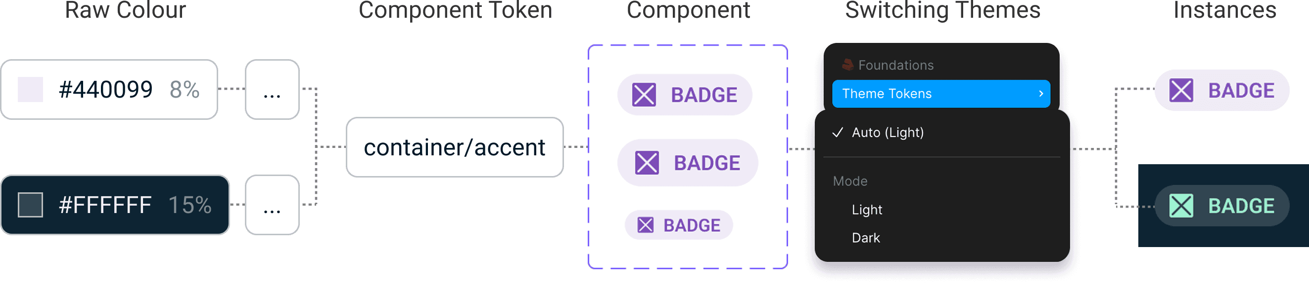
Both themes were reviewed to ensure contrast and hierarchy still worked properly.
Accessibility
Accessibility was built into the system rather than added later.
Components included clear states such as focus, error, and disabled. Colour usage was controlled through tokens, and typography followed a consistent scale.
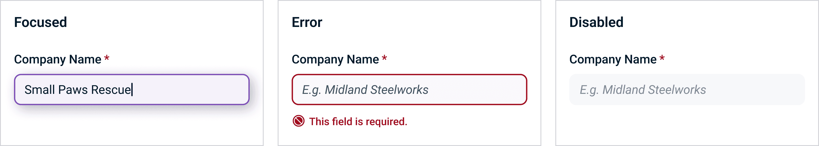
This made it easier for designers to create accessible screens without having to think about it every time.
Working with Developers
I worked closely with developers to align how tokens and components were structured.
This helped reduce ambiguity during handoff and made it easier to translate designs into code. It also meant the system was more likely to be adopted, rather than sitting unused in Figma.
Impact
The system gave teams a shared starting point.
Design work became more consistent, and there was less need to recreate components. It also made it easier to support new requirements like dark mode without redesigning existing screens.
Reflection
Spending time on the foundations early made the rest of the system easier to build and maintain.
Using semantic tokens was particularly important for theming, and the atomic structure helped keep everything organised as the system grew. Working closely with developers also made a big difference in how the system was used in practice.